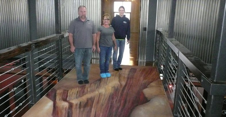
On the verge of falling into this deep canyon, Lee Ann Harris, Dave Verlennich, and client Micki Horab demonstrate the illusion of artist Julie Kirk’s 3-D masterpiece.
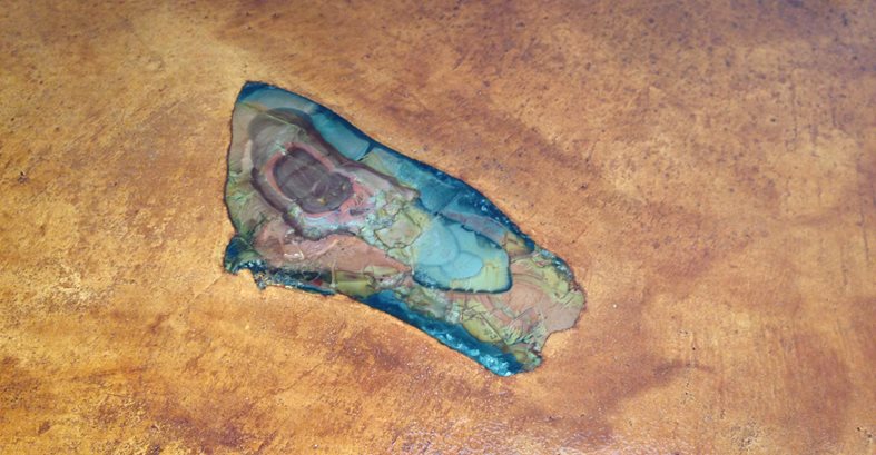
Ammonites were embedded in the acid stained countertops.
Using dyes, artist Mickey Harris colored his very detailed airbrush graphics.
We recently completed a 3,600 mile round trip drive to Williston, North Dakota to work on an extravaganza of decorative concrete applications. Unlike Willie Nelson singing about his desire to get “on the road again”, after this journey, we have no immediate plans to get back on the road again especially considering our decorative concrete urban assault vehicle only got 7 miles per gallon as a result of towing a trailer. So much for eco-boost fuel economy!
When client, Micki Horab contacted us to look at a project in her home city involving high-end stained floors and concrete countertops, there was a very low likelihood that we would get involved considering the distance. She suggested flying up first to check out the project to get a feel of what she and her family were trying to accomplish. All of the conversations and email exchanges up until this point had discussed pre-cast concrete countertops, an erosion sink and roughly 5000 square feet of stained floors.
Upon my site visit, it became apparent that they were trying to achieve a handcrafted, very organic look which cast-in-place lent itself to. So the decision was made to cast the counters in place with the exception of the sink. There was minor cracking on the floors considering this was an elevated pan deck and when questioned about them, Micki and her mom both answered that they love the cracks. I had to smile and I knew at that moment that these were really cool clients considering that they embraced concrete for what it is, complete with all of its imperfections and nuances.
During this first visit, we put down a series of acid stain and dye samples in a closet so we could hone in on the colors for the actual installation. After a successful initial field trip, it was time to get back and get busy on building the mold for the sink.
Originally our team had discussed pre-casting the sink at our shop but we were concerned with damage during transit. What’s more, it would have been very difficult to move it up to the top floor because of the weight. We decided to build the mold at the shop and after avery long two days of driving, Sunday evening we poured it on site just feet away from the cabinet it would sit on which worked out great.
Monday morning started off with forming the cast-in-place counters while simultaneously prepping the floors and masking all of the walls for the staining and dyeing process. By the end of Tuesday evening we were ready for our cast-in-place installation. Early Wednesday morning and after three solid days of curing, we began with flipping and de-molding the erosion sink considering we had to set it in place to be able to pour the cast-in-place counter up to it.
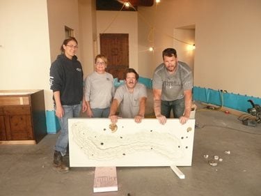
Happy workers: Wife Lee Ann, Dave, Brian and client Micki after a successful pour and de-mold of the erosion sink.
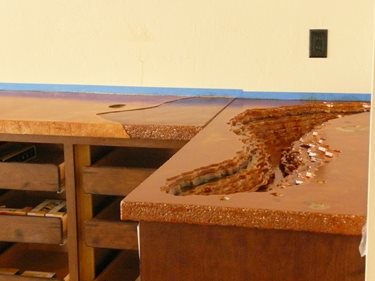
The engraved textured edge of the erosion sink was carried over to the edge of the cast-in-place countertop to tie the two together.
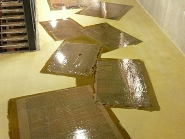
Once this behemoth was de-molded which took roughly 1-1/2 hours, we had some minor detailing and sanding and then it was time to install it. Because of the weight, minor modifications were made to the existing cabinets to help support it. With the sink in its final resting place and masked, we poured all of the cast-in-place counters complete with embedded geodes, ammonites and hand troweled organic veins for a very natural look. The counters were cured by covering them with plastic for the next two days.
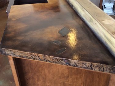
The countertops show interesting coloring techniques with embedments.
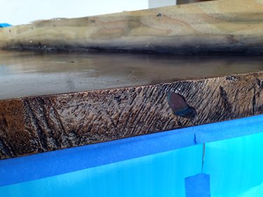
Notice the interesting texture edge with embedded object.
Organic veins were troweled in to the concrete.
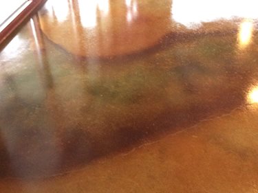
Thursday and Friday were spent coloring floors with roughly 2,000 square feet of water-based dye and 3,000 square feet of acid stains. The dyed sections were done with diluted waterbased Wheat to create a lightly colored canvas so the air brushed graphics and epoxied news print graphics would be the focal point. The acid stained sections consisted of a blend of four colors sprayed wet into wet to create a variegated look.
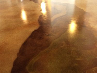
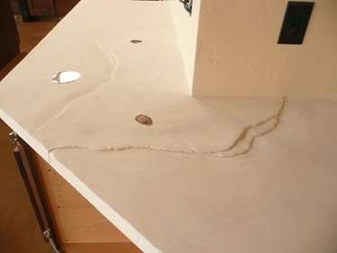
Organic looking veins were created using acid stains.
A fine example of unique staining where acid stain colors bled together.
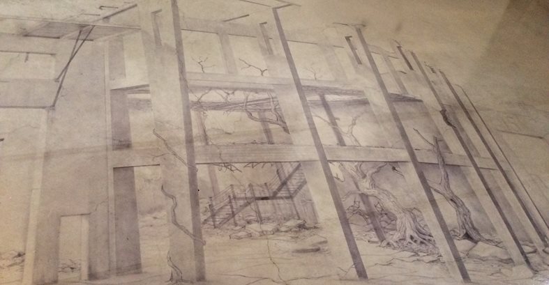
After a long week of pouring and staining, late Friday evening we had all of the counters and floors poured, cleaned and detailed. As if this project was not unique enough already, Micki brought in two extremely talented artists to help carry out her vision. The first was well known airbrush artist Mickey Harris (no relation) to create graphics over the top of what we acid stained and dyed. Ancient ruins, maps and western themes were just a few of the art pieces he airbrushed using dyes as his medium. His work was really stunning especially for someone like me as an aspiring weekend and holiday air brusher. The other artist was well known street artist/professor Julie Kirk, who painted a 3-D canyon on the ramp between the entertainment room to the main living quarters which came out unbelievable.
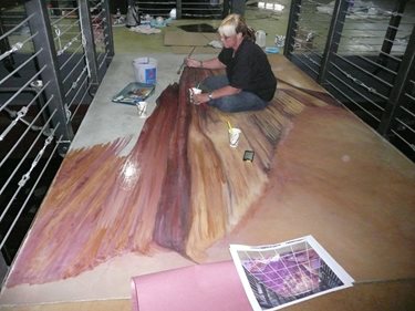
Talented artist Julie Kirk hand-painting the 3-D graphic.
Because of scheduling, three weeks would transpire allowing the other artists to complete their work before we could get back to Williston to complete the staining of the countertops and then the sealing of everything. Trust me, we did not drive but, rather flew. When we arrived back for the final phase of the project, we masked the floors, walls and cabinets in preparation of the coloring of the countertops. Once the coloring was complete, we cleaned and neutralized the stain residue and then spent that evening epoxying over the graphics client Micki had previously epoxied down on one portion of the floor. The next day the project was completed with rolling on Impact polyurethane on the counters and floors which provided exceptional abrasion resistance.
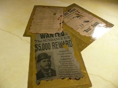
The client had newspaper print printed and then she epoxied them to the floor. We applied a second coat of epoxy over
the top of them to lock them down followed by a clear coat of Impact polyurethane.